AAN Brand Transformation

Branding • Strategy • UX • Marketing

From agency-selection strategy to implementation: leading the AAN through its first major rebrand in two decades.

Overview

The American Academy of Neurology (AAN), the world’s largest association of neurologists and neuroscience professionals, initiated a comprehensive brand refresh—the first in over 20 years. With over 40,000 members and a growing public audience, AAN aims to modernize its brand identity to align with its evolving mission: promoting brain health for everyone.

Preserving AAN’s prestige and recognition while enhancing engagement with members and the public across all platforms.

My Role

I was selected to research and compile recommendations of Brand Agencies to partner with. Reviewing and interviewing these agencies was also a portion of my duties. While my focus was on visual identity, I was also a leader in guiding the conversation around positioning and tone of voice.

Key highlights of this process:

Considerations & Challenges

Strategic Risks

Digital Presence Deficiency: AAN’s current brand lacks a strong digital-facing identity, which limits engagement and conversion on digital platforms. This threatens growth initiatives in both membership and revenue.
Outdated Perception: Without modernization, AAN risks being perceived as outdated, undermining its position as the leading home of neurology.

Operational Challenges

Resource Gaps: AAN does not currently have the internal resources to execute the brand update. An external agency is required for brand assessment and design, while internal staff will handle implementation.
Cross-Divisional Coordination: Phase 2 of the brand update requires alignment across departments. Initial audits show the need for clearer collaboration and scope definition.

Stakeholder Engagement Risks

Limited Member Involvement: While member committees won’t be directly involved in execution, their feedback is essential for transparency and buy-in. Lack of engagement could lead to resistance or misalignment.
Leadership Prioritization: The brand update is part of a broader digital transformation plan. Competing priorities—like the Brain & Life transition—may require reprioritization or pausing of other initiatives.
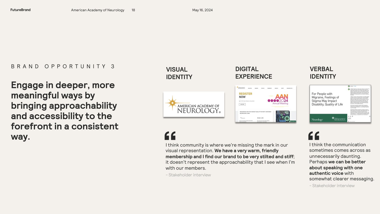
Brand Consideration Slide

Positioning & Strategy

I joined the core rebranding team to review agency findings and shape our overall strategy. My deep research into industry trends and best practices provided valuable strategic insights.

By asking thought-provoking questions, I helped unify our strategic direction and design phases. This collaborative effort successfully positioned our brand as "The catalyst" in brain health.

As a member of the core rebranding team, I participated in interviews and reviewed the agency's findings. My insights were particularly valuable, as I always conduct in-depth research on historical context and current trends for every campaign and initiative I design. My regular deep dives into best practices—both within the medical and association spaces and beyond—allowed me to ask thought-provoking questions of the team and our partner, which helped unify our strategic direction and design phases.

This work helped our agency determine our position as "The catalyst" in brain health.

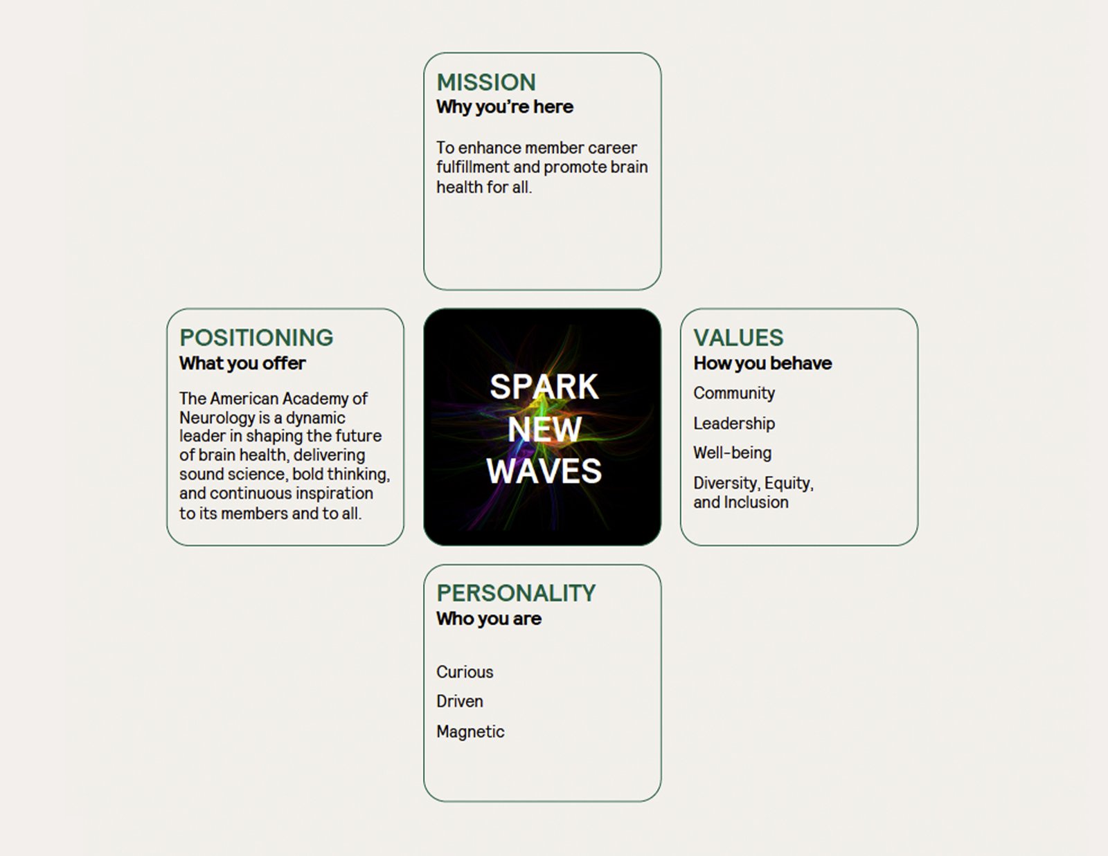
Now that our agency partners and the core rebrand team agreed on our position in the market, it was on to how we move forward. Our partners created an internal rally cry with four key categories for us to check our future content and designs against. Now with every design, I use this method to guide marketers, writers, fellow designers, and myself. This has proven an invaluable tool in keeping us within our brand.

Strategic Brand Positioning
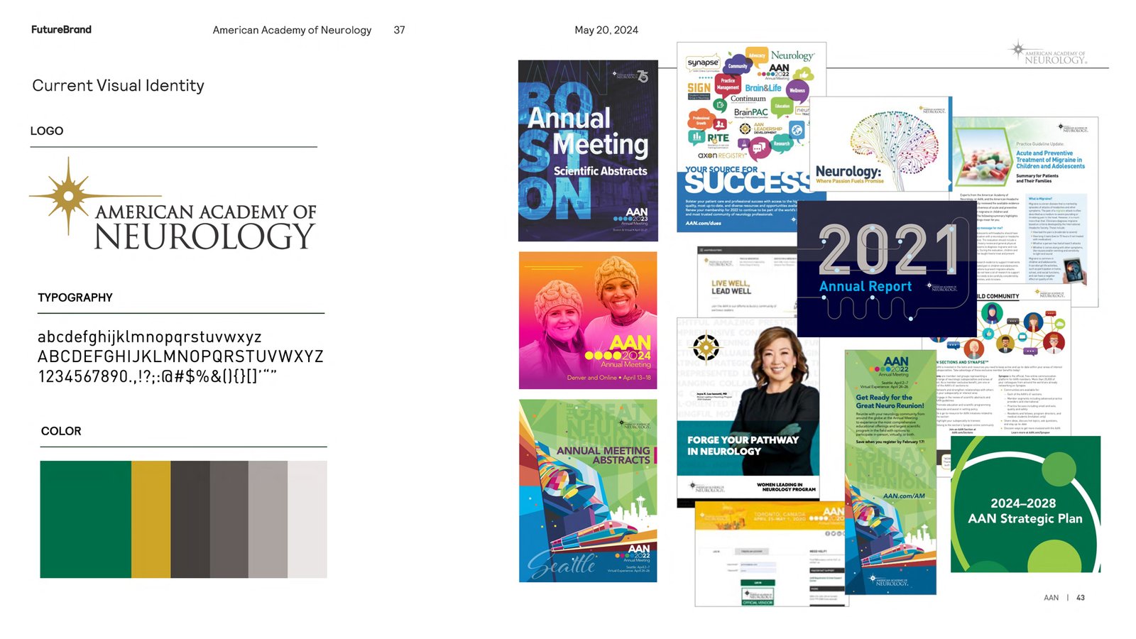
Previous Brand Elements

Visual Design: Outdated Branding

An external visual audit revealed that our brand lacked a consistent tone and throughline. The issue was not individual designs, but a fragmented overall brand approach.

I highlighted to the team our organic shift toward a more expressive visual style, marking a clear departure from our traditional, analytical brand elements. These insights were crucial for establishing a new, research-backed visual tone.

Our agency partner performed a visual design audit and presented what I considered a difficult truth to the team. The audit showed at a glance how our brand had become a collection of designs that lacked a consistent tone and throughline. While the individual designs weren't the issue, it was clear that our overall brand approach needed to be redefined.

I emphasized to the team that the audit also highlighted our shift toward a more expressive visual style, a clear departure from our traditional, analytical brand elements. This point was crucial for setting the stage for the new tone I wanted to establish based on research presented.

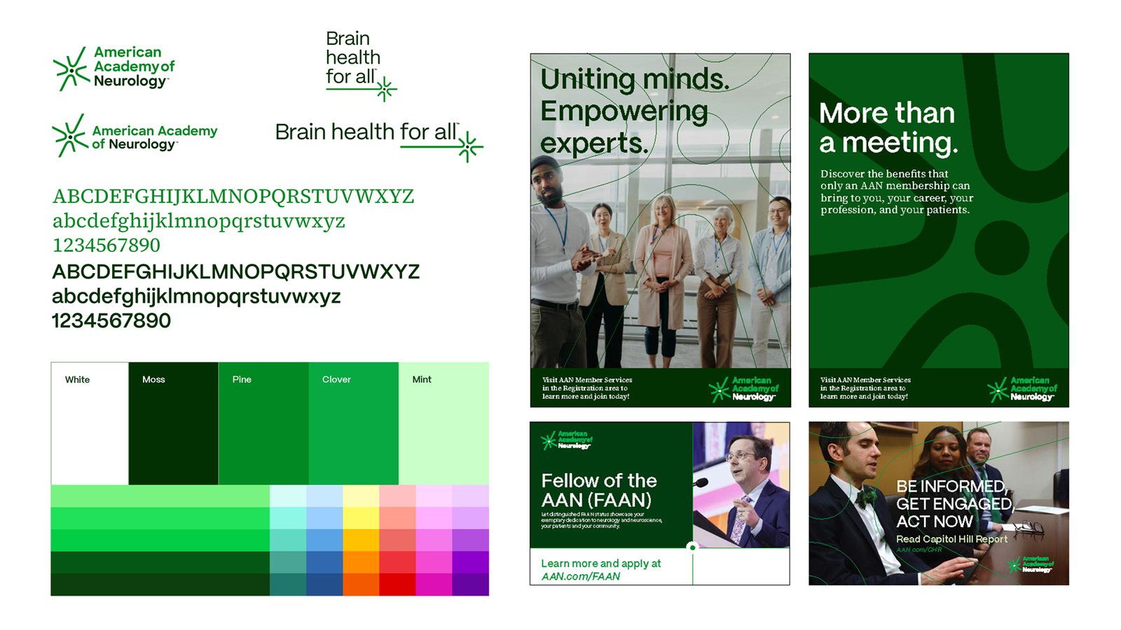
Visual Design: Updated Branding

Translating our new positioning into a visual identity was time-intensive, but our established strategy made reaching consensus much easier.

I provided technical input and united the team around viewing the brand as a complete ecosystem, resulting in a modern, scalable design system that honors our heritage.

Developing the visual representation of our revised positioning and verbal identity was the most time-consuming part of this project. But having those elements established made it much easier to reach a consensus on the visual design and subsequent digital direction. Along with providing technical input, I successfully united the team around the principle that a brand is more than just a logo—it's an entire ecosystem.

After several rounds of feedback, our agency partner delivered exactly what we were looking for: a modern design with a scalable system that honored the brand's heritage.

Updated Designs
Previous Brand Elements

Validation: Sparking a Movement

I proposed "All Green" as a visual rallying cry to accompany our new tagline, prioritizing engagement over rigid uniformity.

By encouraging a spectrum of greens alongside our core corporate colors, we sparked an organic, widespread brand movement.

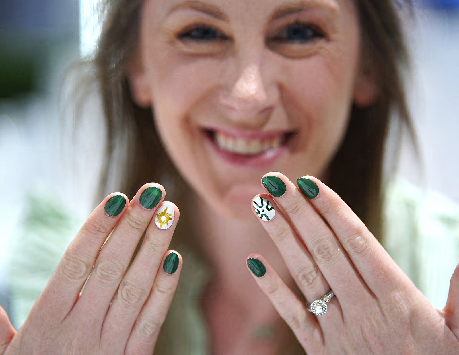
The results are highly visible: staff and members now consistently incorporate green into their wardrobes, presentations, and social media.

Before our agency partners began the visual design phase, I urged them and the AAN to consider making "All Green" the accompanying rallying cry for the new "Brain health for all" tagline.

I justified this approach with a simple principle: engagement. Allowing people to embrace a wider range of greens helps create a visual movement rather than just a singular brand—think of a popular Irish holiday. This idea was accepted and implemented while still keeping a set of core greens as the official corporate colors.

The results have been overwhelmingly positive. I now see most staff wearing something green every day, and members do the same at every event. They've even started incorporating the color into their lectures, social posts, and even their professional wardrobe.

The Designs

Asset Management • Digital Design • Print Design • Motion Graphics • Photography Director • Campaign Design • And So Much More

Translating all of the branding work into tangible results across every touchpoint.

Continue Exploring